How did the bad product manager get a job making butter?
They had a high churn rate. *Ba dum tsss!*
Welcome to the Product Party newsletter 🎉 Product Party is a weekly newsletter connecting product-minded people to ideas and content to stimulate conversation and help to solve real-world problems. All with a bit of fun sprinkled in.
We would love feedback on how we should evolve Product Party to make it more helpful for you, so please check out the section at the end of this newsletter to let us know your thoughts.
Meme of the Day
Bad user experiences cause higher customer churn rates.
We are often in discussions with leadership and have to weigh the impact and benefits of a feature to decide if it should be built. The decisions are based on face value metrics that focus on whether you should invest in revenue-generating or customer experience-improving features.
Suppose you and your team prioritize the revenue-generating features only. You may find that the lack of focus on user experience will lead to feature-laden tech, which could run into problems such as system stability issues over time. These issues can add up and directly lead to a fleeing of customers you fought so hard to attain.
So how might we better support the need to improve the customer experience for the sake of future revenue generation?
1. Everyone remembers poor-performing technology.
I might be a little biased, being a decade into a career in tech, but I will admit…I have, on several occasions, hated apps or websites so much due to their poor performance that I completely deleted my existence in their world.
One of the best examples here was the trigger for me to jump ship from Friendster (don’t Google the years on this one - think prehistoric internet) to Myspace. Friendster had a mediocre UI but when it came to the site’s stability and subsequent UX issues really pushed me out into the world to find alternatives. Myspace popped up just in time to pick up all the users like myself who hated the performance issues, had the plan to scale, and almost instantly converted every person I know over. Ultimately making Tom a rich, rich man.
Long story short - don’t sacrifice your team’s desire to implement or change the tech stack to help make your product perform better.
P.S. Remember this guy? #1 friend right there.
2. People use their mobile devices heavily. If your mobile experience sucks, people will also remember this.
If your product is customer-facing, there’s a good chance you have a mobile app and/or a mobile web page experience that you’re providing. Ideally, your designers and devs had the foresight to plan out the experience in a mobile-friendly way. However, if not, you may want to talk with your dev team about how to address this.
According to Think with Google:
People who have a negative experience on mobile are 62% less likely to purchase from that brand in the future than if they have a positive experience.
If you are interested in checking out some of their exciting and supporting metrics regarding mobile experiences, check out this link.
In another related article on the Dogtown Media site, they highlight:
Research shows that about 89% of average mobile app users are lost in the first 7 days after install, and nearly 95% within the first 30 days. Scary stuff! So what does that mean for your mobile app business? A high churn rate indicates your customers aren’t happy with your product and your leaky funnel could be pouring potential revenue down the drain.
The metrics and critical benefits of making mobile a focus are clear. If mobile is a consideration for your product, don’t forget to talk about how you might extend any web features to the mobile experience to round everything out.
3. Increased complexity = increased decision time = haters.
I love to nerd out on the Laws of UX. There are many great and easily digested examples of best practices on the site that any designer or product person can learn and use.
One of the most relevant to retention is called Hick’s Law. Here’s a brief explanation from this post:
Hick’s Law states that the time taken to make a decision increases with the number and complexity of choices.
In other words: The more options a user is presented with, the longer it will take them to make a decision.
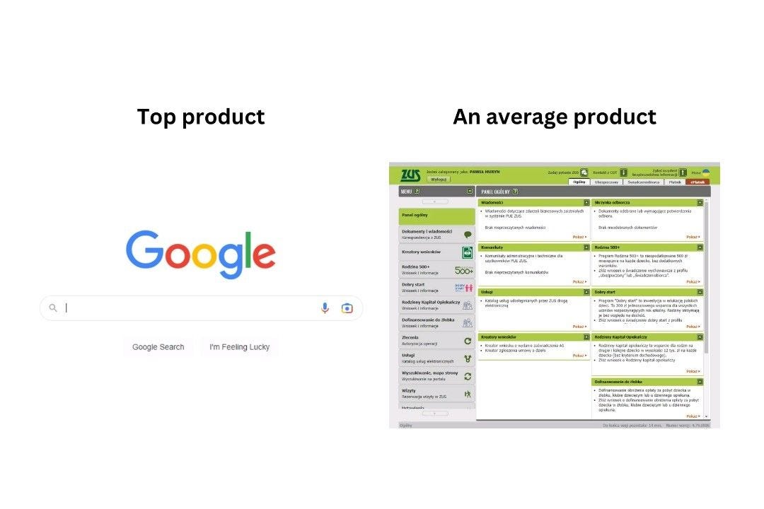
If you take a look at any large org’s internally developed products, you’re probably going to see a similar experience to this post from Paweł Huryn on LinkedIn, which showcases how feature over-saturation and lack of focus on experience can quickly get out of hand:
If you have the users’ of your product attempt to wade through an overly complex UI/UX to achieve a goal, they will pretty quickly start to look on the market for a product that does most of what you can offer but looks nicer. If your users are internal and don’t have much choice but to use your product, you’ll find their happiness (and more than likely productivity) will be reduced. Either way, you’re up against a lose/lose situation if you don’t take steps to address the complexity and provide an enjoyable and as simple as possible experience.
Do you have a practice or way that you help to improve the design process with your team? Share it with us by clicking “Leave a comment.”
Listen of the Day
Read of the Day
Want to help make this newsletter even more useful for you?
Please comment via the following button and/or fill out the brief survey below and let us know your thoughts.


