
Why users ignore your best features.
...and what the (Product Party) science says you should do about it.

I once spent weeks perfecting what I thought was a game-changing feature: a sleek button that would help associate bankers transfer calls to licensed colleagues in specific states. The implementation was flawless, the UI polished, and the functionality worked exactly as designed.
And no one used it.
While I was admiring my handiwork, our bankers kept using their dog-eared printed lists of direct extensions. My beautiful button had become invisible, blending seamlessly into the UI wasteland.
This wasn't just resistance to change; it highlighted the actual workings of our brains in relation to technology.
It served as a humbling reminder of the disparity between our perceptions of user behavior and their actual behavior.
PS Real quick! I’m connecting with some other creators that write awesome content that I think you might like. Check out SMRTR Tech, a free daily newsletter that summarizes the most interesting stories in technology, delivered every weekday and readable in 5 minutes.
Topics include artificial intelligence, space exploration, robotics, quantum computing, clean energy, software development, and other innovations shaping the future. Trusted by thousands of curious minds and industry insiders who want to stay ahead in tech.
Let’s continue.

Invisible Feature Phenomenon
Your users aren't ignoring features out of stubbornness - they're following cognitive patterns that we often design against, rather than with.
When Slack introduced "Stories," they saw a 30% drop in weekly active users within three months. The culprit? Added cognitive burden - seven new interaction points increasing decision time by over 2 seconds.
Heatmaps showed that 68% of users didn't see the Stories toolbar, sticking instead to familiar pathways. Our brains ruthlessly filter out anything that disrupts established patterns.

Joy of Discovery
Here's the counterintuitive truth: users tend to embrace features they discover on their own.
When Airtable forced a "New Automation" pop-up, adoption crawled to 9%. When repositioned as a subtle "+" menu for natural discovery, adoption jumped to 41%.
Why? Self-discovered features trigger dopamine releases that create ownership. I experienced this when I found Figma's spacebar-pan feature after two years of clumsy zooming.
I immediately told colleagues about it, feeling like I'd discovered buried treasure, despite the fact that it was in the tutorial I had skipped.
This explains why elaborate onboarding often backfires - it transforms discovery into instruction, joy into obligation.
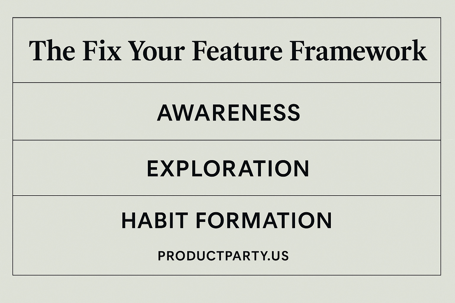
The Fix Your Feature Framework (aka A Three-Layer Framework You Can Actually Use)
Instead of building more invisible features, use this structure that works with human psychology:
Layer 1: Awareness (The Peripheral Vision Problem)
Most features fail here – users never notice them. However, forcing awareness through pop-ups is like handing someone a map when they haven't decided to embark on a journey.
Target Metric: 80 %+ exposure rate
Tactics:
Create subtle "Easter egg" animations – slight movements that trigger pattern-recognition without demanding focus
Use peer comparison nudges – "85% of teams like yours use this feature" creates FOMO without being pushy
Implement contextual highlights – a gentle glow around the export button when a user completes a project
Layer 2: Exploration (The Playground Effect)
Once users know something exists, they need a safe space to experiment.
Target Metric: First action within 72 hours
Tactics:
Create sandbox environments – Figma's "playground" file for new users is a masterclass in this approach
Use concrete loss aversion – "Teams using this feature save 3 hours weekly" hits harder than generic FOMO messaging
Design clear undo paths – nothing kills exploration faster than fear of breaking something important
Layer 3: Habit Formation (The Neural Highway)
Most feature adoption strategies fail here. Awareness and initial use are meaningless if the feature isn't part of the workflow.
Target Metric: Depth-of-use score (≥4/7 feature touchpoints)
Tactics:
Create skill progression that unlocks capabilities – the dopamine hit from "leveling up" builds powerful reinforcement loops.
Implement context-aware tips – "I see you're doing X manually again. Try Y next time to save 2 minutes."
Celebrate impact milestones – "You've saved 8 hours this month using this feature."
Implementing this framework doesn't require a complete product overhaul. Even minor adjustments to how features are presented can significantly improve adoption rates when they align with how our brains naturally process information.
Final Thoughts
The most underutilized features in your product aren't failing because they lack value; instead, they are underutilized because they lack effective implementation. They're invisible because they don't align with how users' brains naturally work.
The question isn't "How do we build more features?" but "How do we use human psychology to make valuable features discoverable?"
Your users aren't ignoring you on purpose. Their brains are busy, and you're making them work too hard.
What feature will you simplify first?
Until next week,
Mike @ Product Party
Want to connect on LinkedIn? Click here.
Want to connect with me and other cool product people on Bluesky? Click here.


Thanks Mike.
I remember landing on a website where they had a new AI agent. It would pop up on full chat window in the browser and even after minimising it to a small speech bubble, it would pop back up on every webpage I visit on that site. After a few product views I got so sick of it I just closed the tab.
Great post, thanks Mike!